Wednesday, 6 April 2011
Monday, 4 April 2011
6. What have you learnt about technologies from the process of constructing this product?
Question 6 of the evaluation!
For this project, I have used many different technologies.

This is a Mac computer. I used this computer from my preliminary task right through to the end of my music magazine. This is a good computer to use as it has safari- which is the Internet, and programs such as Indesign and Photoshop, both of which I used in the tasks. This computer also has PowerPoint and word, again, I used both. This is good for the publishing sector because it has a lot of decent programs, which are easy to use to make a music magazine.

This is a digital camera, which helped me take some of the photos. This helped because it helped me take some of the photos. It took me a while to work out how to use this camera, for example, looking back at my photos, but it was easy after this. This is good as a stills camera, but I had some trouble using this without a tripod.

This is a memory card reader, which I used to get photos off of my phone and the camera. This was very useful as it was easier than using cables and wires. This would be very useful to the publishing sector because, again, it is much easier than using cables.

This is the LG Cookie. This is a photo of my phone, which is used for nearly all my photos. It has a 3.0-mega-pixel camera, which is an okay standard. I found this much easier to use than the camera because I knew where to look for my pictures straightaway, and I found it easier to use without a tripod.
This is my memory stick, on which I kept all my work. This was very useful because it meant I had all my work saved on several places.

This is the blogger logo, which is where my work is on there to be marked. Blogger is very easy to use and you can put videos on there from www.youtube.com and www.slideshare.net. I liked blogger because it is easy to upload posts and easy to embed work from other sites.

This is the YouTube logo, which is where I embedded videos to my blog. This was very easy because it has a share to blogger button, and at a click of a button, the clip is on your blog!

This is the Photoshop logo. I used Photoshop to edit some photos. I liked using Photoshop because I had used it before in school. I would use something like Indesign because Photoshop is not the best thing to use to create a music magazine, as it doesn’t have the best layout.

This is the Indesign logo. I used Indesign for the whole of my music magazine, and I found it very conventional for making a music magazine, and found it useful for the double page spread, mainly because it has a way of making columns for writing an interview.


This is the word logo. I have used word for my evaluation. I find word very easy to use as it is split up into different headings e.g. ‘Home’, ‘Insert’ and more.
For this project, I have used many different technologies.
This is a Mac computer. I used this computer from my preliminary task right through to the end of my music magazine. This is a good computer to use as it has safari- which is the Internet, and programs such as Indesign and Photoshop, both of which I used in the tasks. This computer also has PowerPoint and word, again, I used both. This is good for the publishing sector because it has a lot of decent programs, which are easy to use to make a music magazine.
This is a digital camera, which helped me take some of the photos. This helped because it helped me take some of the photos. It took me a while to work out how to use this camera, for example, looking back at my photos, but it was easy after this. This is good as a stills camera, but I had some trouble using this without a tripod.
This is a memory card reader, which I used to get photos off of my phone and the camera. This was very useful as it was easier than using cables and wires. This would be very useful to the publishing sector because, again, it is much easier than using cables.
This is the LG Cookie. This is a photo of my phone, which is used for nearly all my photos. It has a 3.0-mega-pixel camera, which is an okay standard. I found this much easier to use than the camera because I knew where to look for my pictures straightaway, and I found it easier to use without a tripod.
This is my memory stick, on which I kept all my work. This was very useful because it meant I had all my work saved on several places.
This is the blogger logo, which is where my work is on there to be marked. Blogger is very easy to use and you can put videos on there from www.youtube.com and www.slideshare.net. I liked blogger because it is easy to upload posts and easy to embed work from other sites.
This is the YouTube logo, which is where I embedded videos to my blog. This was very easy because it has a share to blogger button, and at a click of a button, the clip is on your blog!
This is the Photoshop logo. I used Photoshop to edit some photos. I liked using Photoshop because I had used it before in school. I would use something like Indesign because Photoshop is not the best thing to use to create a music magazine, as it doesn’t have the best layout.
This is the Indesign logo. I used Indesign for the whole of my music magazine, and I found it very conventional for making a music magazine, and found it useful for the double page spread, mainly because it has a way of making columns for writing an interview.
This is the PowerPoint logo. I have used PowerPoint for some of the evaluation. I found it easy it upload my PowerPoint’s to slide share.
This is the word logo. I have used word for my evaluation. I find word very easy to use as it is split up into different headings e.g. ‘Home’, ‘Insert’ and more.
Diary entry 4th april
Today, i carried on with my evaluation, and completed question four and started, and nearly finished question 6. for question 5 and 7, i am doing videos.
Monday, 28 March 2011
Diart entry 28th March 2011
Today, I added question 1 and 2 of my evaluation through slideshare and added my question 3 to this blog. I have now completed questions 1-3 of my evaluation.
3. What kind of media institution might distribute your media product and why?
 I would have the media institute of IPC media to distribute my magazine because:
 · They have distributed magazines such as: Country Life, Horse & Hound, Rugby World and Decanter, as well as lifestyle brands including Nuts, Mousebreaker and NME.
· IPC also includes: Look, Now, Chat and Woman; TV entertainment brands including: What's on TV, TV Times and TV & Satellite Week and, online, the goodtoknow network.
· For women, IPC distribute: Marie Claire and InStyle, lifestyle brands including woman&home and essentials and home interest brands including Ideal Home, Livingetc and housetohome
· IPC Media produces over 60 iconic media brands, with print alone reaching almost two thirds of UK women and 42% of UK men – almost 26 million UK adults – while our websites collectively reach over 14 million users every month.
I would want IPC media to distribute my magazine mainly because they have such a large amount of men and women in their range, but they only have one music magazine that may appeal to people who enjoy pop music. However, NME doesn’t really have as much pop, though it does appeal to a wide audience.
Pop is also associated mainly with females, so this would fit in with many of the female readers. This will also provide a wider audience, as I have aimed my magazine at 8-18 year olds.
Forum
http://answers.yahoo.com/question/index?qid=20100825151825AAYI0rO
this is a discussion about stereotypes of pop music and intelligence. I used the ideas in this in the second question of my evaluation
this is a discussion about stereotypes of pop music and intelligence. I used the ideas in this in the second question of my evaluation
Monday, 21 March 2011


21st March Diary entry
Today, amongst doing our evaluation, i finished off my editing of my magazine:


These are the finished products!!
Monday, 14 March 2011
13th March Diary Entry
this week, we got more feedback on our magazine. I have again improved the pages, and have to add new pictures as the main ones, which will be taken during the week. We have also been given our prep for evaluations, which will also be started today.


 On the front page, all i need is the main image, as with the double page spread. I left one of the pages of the double page spread for a big picture, instead of having smaller images.


Monday, 7 March 2011
diary entry 7th march
Today, we got feedback on how our music magazines were. I got feedback where i have a lot to edit, so i will be editing all three of my pages: the front page, contents and double page spread. I am still editing the front cover, and still sticking to greys, blacks, whites and the main colour purple
Monday, 14 February 2011

Monday, 7 February 2011
Contents page analysis
Diary entry for 7th Feb
Today, I finished off my front cover and started on my contents page, which is nearly finished
First draft contents page
I am following with the blue writing in a two tone of the colour. I am going to add photos i have taken next week, but here i is so far...


Front cover

However, now I have edited it again, and decided that pink is not the best colour, and have changed to to the colour blue. I think that the blue is better, because it stands out and deviates from the norm, as I am doing a alternative pop music magazine.
Monday, 31 January 2011
31st January
Today, apart from finishing my front cover, I have added some inspirational videos from www.youtube.com, but first, I went onto www.google.com to find a list of pop singers. The list stated the top ten female pop singers. These were: Lady Gaga, Beyonce, Shakira, Kesha, Britney Spears, Miley Cyrus and Mariah Carey.
Diary entry 31st January
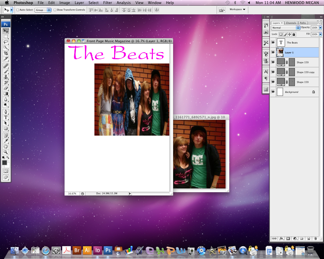
Today, I finished my front cover of my pop magazine. I kept the name of my magazine as 'The Beats' because it goes well with all genres of music, because all music has to have a beat. I have the text as two types of the colour pink, as I always associate pop music with girls, so my target audience would be young-teenage girls. This is my music magazine front cover and the print screen. I didn't want to add too many pictures because it would look unprofessional, so I had the main picture bigger with a smaller photo in the corner. The big yellow circle was added to draw attention too one of the prizes: a samsung galaxy. I print screened my work to show the amount of layers used to make my front cover of my music magazine.


Monday, 24 January 2011
Another diary entry for 24th Jan
Diary entry for 24th Jan


Tuesday, 18 January 2011
Name of music magazine
For my magazine, I have decided to use the title of: Rebel, as many people stereotype people who listen to the alternative rock/punk genre to be a bit rebellious, and not in to the ‘norm’ of music. The connotations of the word ‘rebel’ are: people who rebel against something e.g. the government, society and patriarchal values.
Monday, 17 January 2011
Diary entry for 17th Jan
Today, I did the flat plans for my music magazine, and these were for the front cover and the contents page.


Diary Entry for the 10th January
This week, I added music videos to show my inspiration for my magazine. I also added my ideas for names and ideas for magazines. I also did an analysis of two music magazines and looked at 'Kerrang' magazines sales.
Monday, 10 January 2011
Preparation for my music magazine
Having chosen your genre of music magazine, how does it represent anyone associated with the genre?
For my music magazine, I have decided to have the genres that range from alternative punk and alternative rock. Bands that fall into this genre include:
Ø All Time Low
Ø Paramore
Ø Muse
Ø Tokio Hotel and
Ø 30 Seconds to Mars
For my magazine, I have decided to use the title of: Rebel, as many people stereotype people who listen to the alternative rock/punk genre to be a bit rebellious, and not in to the ‘norm’ of music. The connotations of the word ‘rebel’ are: people who rebel against something e.g. the government, society and patriarchal values.
For my magazine, I will use the colours red, black, and white, dark blue and grey. Red will be used because the colour red can be associated with anger, rage, leadership, longing, and willpower, which is what people could associated with what alternative rock bands sing about. The colour black will be used as the colour black has the connotations of: death, evil, mystery and the unknown. Also, the colour black is also considered as a colour associated with this genre of music. The colour white will be used as it is the binary opposite of black, and suggests that there is simplicity of the music and is just as pure as music in the genres such as pop or R&B. The colour dark blue will be used because the colour represents seriousness, which shows people how serious the genres of alternative punk and rock are. The colour grey will be used as it has connotations of modern, futuristic (meaning that this genre could be more popular in the future) and fresh.
For the cover lines, I will do one that is associated with a new band, who will be the main picture on the front cover, which will be about a worldwide tour, their music and how they are doing and their plans for the future. Other cover lines will include: 1. About an artist and their new relationship to another artists, 2. Tour dates for another band, 3. A chance to win two free tickets, 4. Interview with a famous band such as Paramore and 5. An interview about bands breaks up.
For the masthead, I would have the words bold, which will be in the colours red or grey, with a black outline. I would have the masthead in a 3-D type of text type, as 3-D is more modern and futuristic.
For the layout of the front cover, I would have the main picture in the middle right, according to the rule of thirds. I would then have the cover lines on the left hand side of the page, as this would look more professional. I would have the free win cover line on the bottom of the page, with a picture of what is to be won. I would have pictures to accompany the cover lines.
Ideas for Music Magazine band names
Names:
The Beats
Broken Record
Unplugged
Rock Out and
Rock Block
The Beats
Broken Record
Unplugged
Rock Out and
Rock Block
Current state of music magazine sector and audience research
My inspiration for my music magazine is 'Kerrang'. The publisher is 'Bauer' and they also produce other music magazines such as 'Mojo' and 'Q'. Kerrang first concentrated on rock and heavy metal, but now covers a more alternative rock and punk genre. Kerrang was first published as a monthly magazine, but now, because of i's increasing sales, is now a weekly magazine. Kerrang has a reputation for following the trend with the latest rock groups. however, in 2003, sales declined when they followed the genre of 'nu-metal', which was a trend that did not last long. After this, Kerrang focused on more alternative rock/punk bands such as My Chemical Romance, and by 2009, Kerrang's weekly sales were over 50100!!
Kerrang's audience is 60% male and 40% females and range from the ages of 16-24. The magazine is aimed at the rock genre and includes alternative bands such as 'Paramore' and 'All Time Low'.

Kerrang's audience is 60% male and 40% females and range from the ages of 16-24. The magazine is aimed at the rock genre and includes alternative bands such as 'Paramore' and 'All Time Low'.
Analysis for two music magazines


Photos from student magzine


Front cover for student magazine and the contents page


Subscribe to:
Posts (Atom)