Monday 7 February 2011

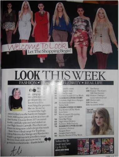
Contents page analysis

This is my contents page analysis from a music magazine. For the pictures, there is one of the editor, a picture for an article of the blonde girl and some for how to subscribe. There is also a main picture at the top of the page. The words 'Welcome to Look let the shopping begin' is the tagline for this particular article. Also, 'Look this week' is in capitals and bolder letters, so it draws the audiences eye into the words. For the editors column, there are quotation marks, which lets the reader know that the words are the opinion of the editors.

Diary entry for 7th Feb

Today, I finished off my front cover and started on my contents page, which is nearly finished

First draft contents page

I am following with the blue writing in a two tone of the colour. I am going to add photos i have taken next week, but here i is so far...

Finished music magazine front cover

Front cover

Today, I edited my front cover for my music magazine, Though i wanted the background white, i have it pink, so the writing is white.
However, now I have edited it again, and decided that pink is not the best colour, and have changed to to the colour blue. I think that the blue is better, because it stands out and deviates from the norm, as I am doing a alternative pop music magazine.